Client
BBDO Hong Kong
Design Brief
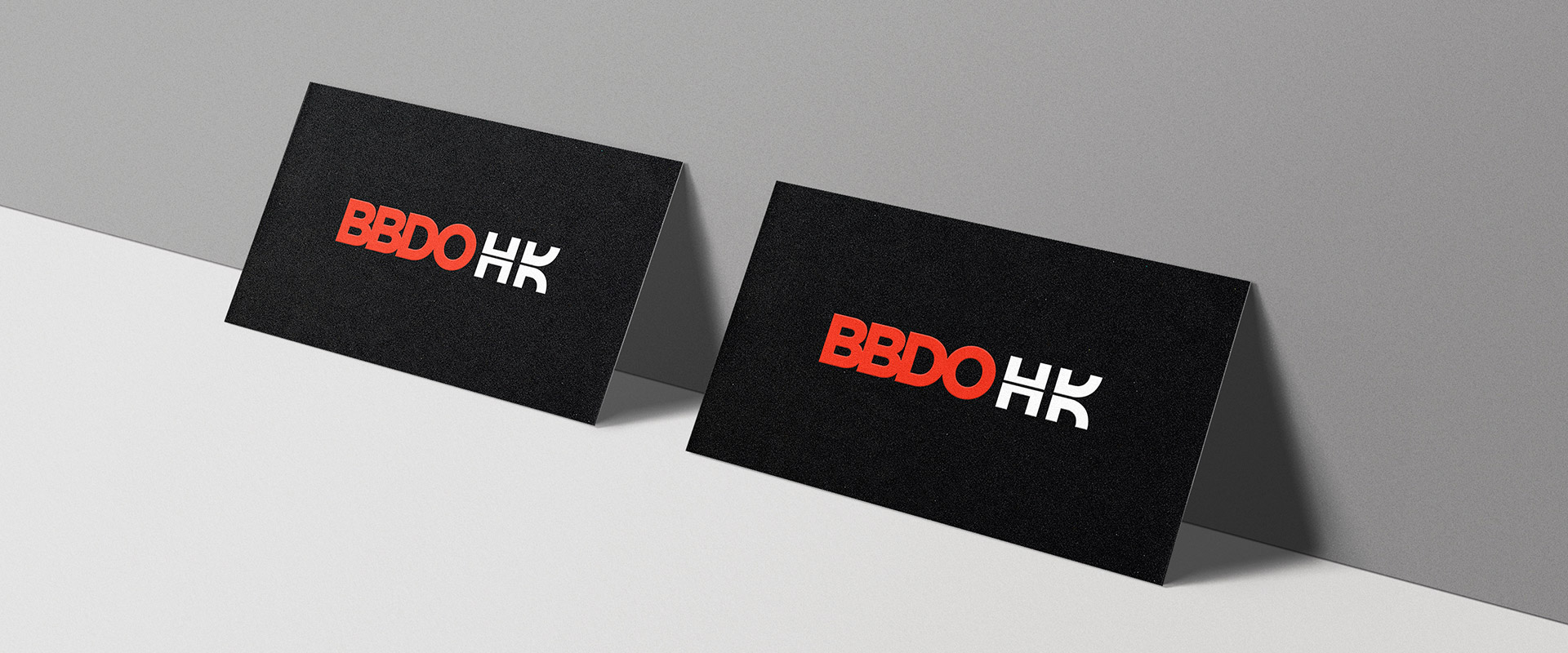
BBDO Hong Kong wanted to embrace a new beginning and unify the team spirit by launching a new logo in January 2020.Design Challenge
The challenge was to communicate a feeling of Hong Kong by only adding the two letters HK next to the existing BBDO logo.

Logo Design
When I visualized the city of Hong Kong, I immediately thought of the iconic reflection of the Victoria Harbor. I also realized that the letterforms "BBDOHK" were horizontally symmetrical. By horizontally striking through the letters "HK", I created an abstraction of the water's reflection on the harbour. Moreover, I created the letter "K" from the "D" contained within the BBDO logo. It helped to create a stronger visual connection with the existing BBDO brand.
When I visualized the city of Hong Kong, I immediately thought of the iconic reflection of the Victoria Harbor. I also realized that the letterforms "BBDOHK" were horizontally symmetrical. By horizontally striking through the letters "HK", I created an abstraction of the water's reflection on the harbour. Moreover, I created the letter "K" from the "D" contained within the BBDO logo. It helped to create a stronger visual connection with the existing BBDO brand.
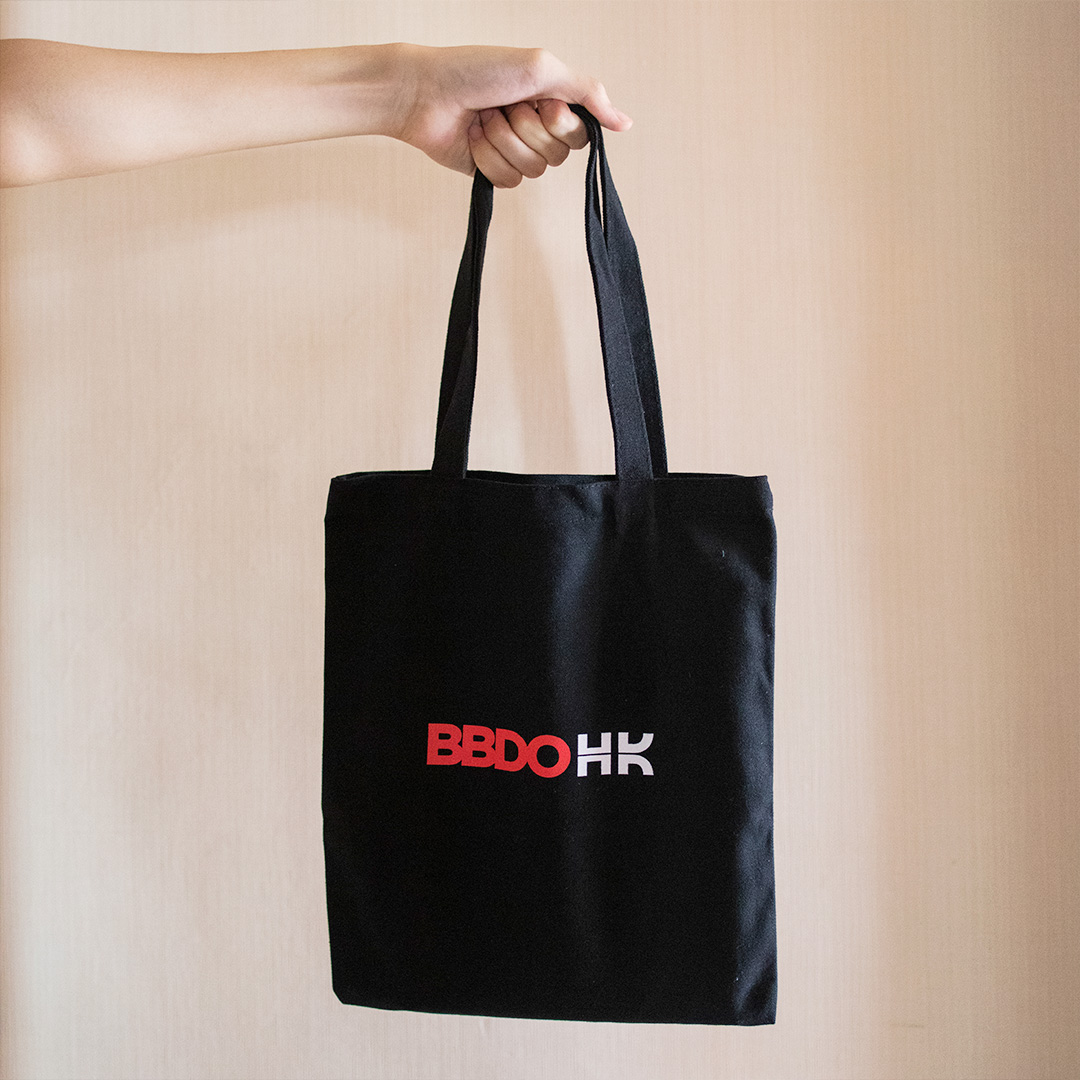
Along with the birth of the new BBDOHK logo, I customized various office stationeries as New Years gifts to our colleagues.


BBDO People Values
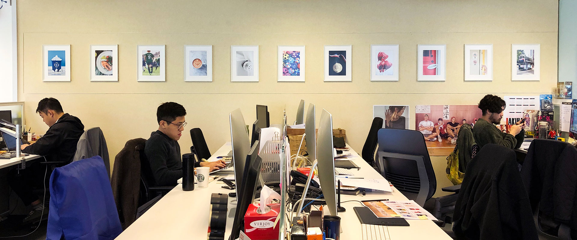
BBDO established 11 "people values" to guide what the company celebrates in one another. However, many of us had not been introduced to the values, and some did not know of their existence. After developing the logo design, I was asked to visualize the 11 "people values" within the office environment. The most challenging part of the project was to subtly immerse the values within the workspace without making it seem like 11 rules to follow.
BBDO established 11 "people values" to guide what the company celebrates in one another. However, many of us had not been introduced to the values, and some did not know of their existence. After developing the logo design, I was asked to visualize the 11 "people values" within the office environment. The most challenging part of the project was to subtly immerse the values within the workspace without making it seem like 11 rules to follow.
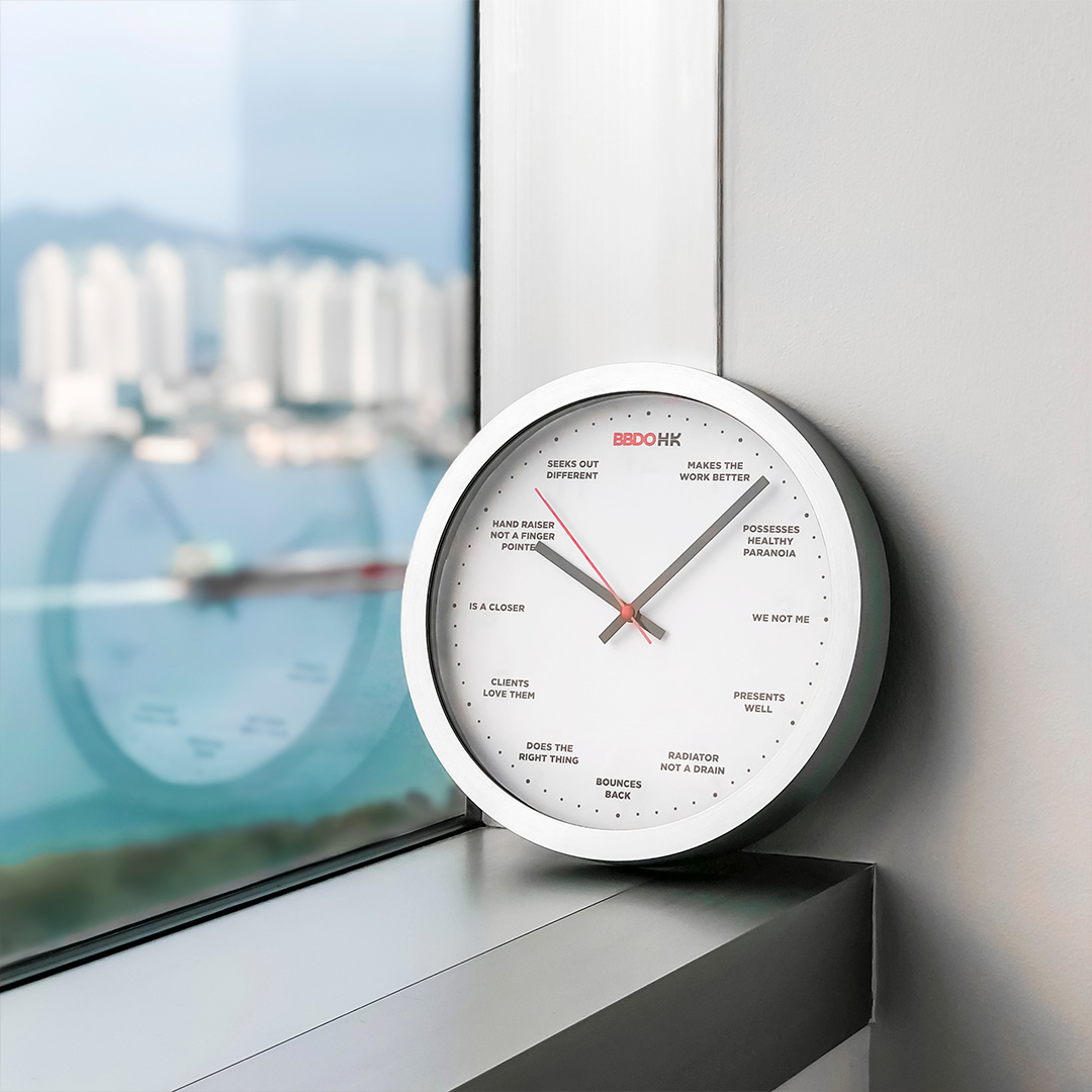

I came up with two unique solutions for the task. First was a BBDO clock. Every office needs a clock, and each clock has 12 digits. I put the BBDOHK logo as 12 o'clock and placed the 11 values to each hour respectively. Everyone in the office would look at the BBDO clock naturally. The clock did not only tell time, but also reminded them of the 11 values consistently. Second, I created 11 art pieces to hang on the office wall. They helped to elevate the mood of the space. By combining fun imagery and hiding the values within the photo, the wall became a fun place to discover and get inspired.
The Work The Work The Work
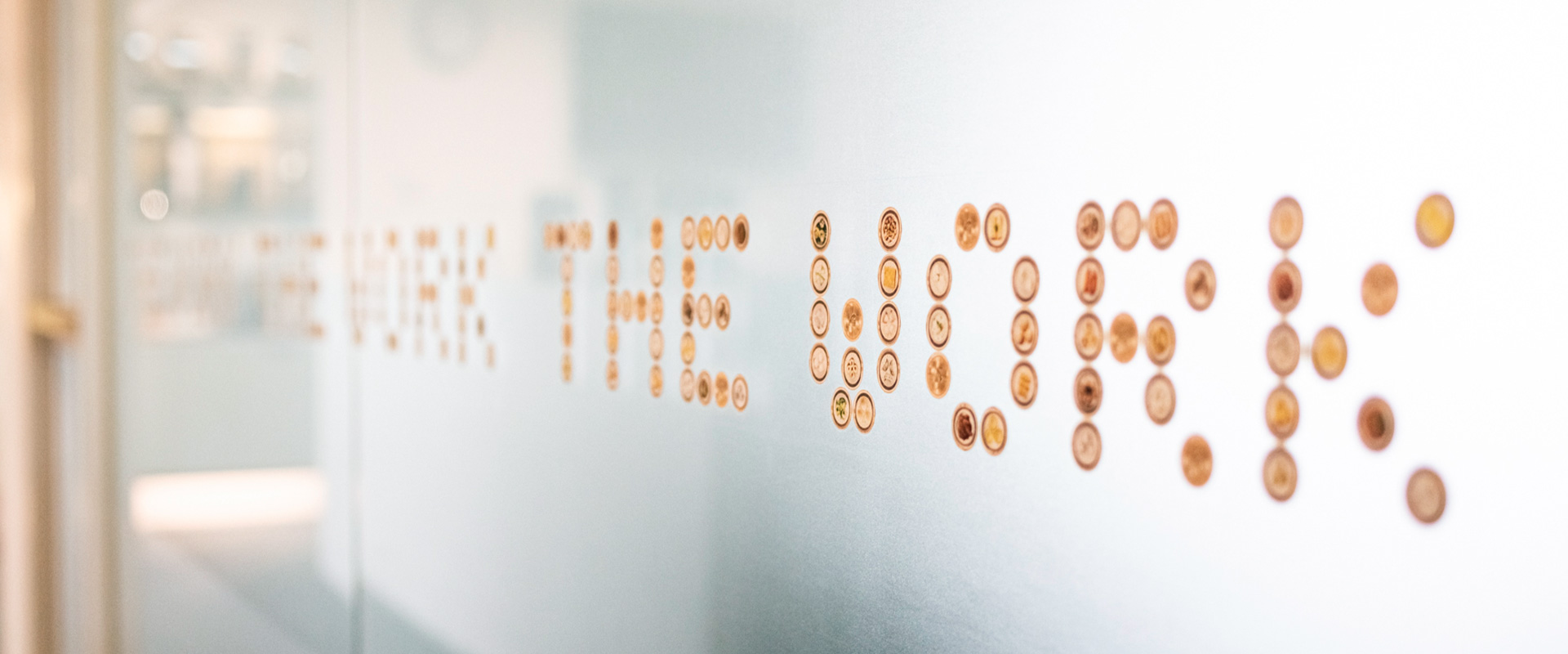
Continuing in the spirit of office decoration, I was assigned to visualize the BBDO brand essence (The Work The Work The Work) on the conference room glass. The challenge was to add a Hong Kong style twist on the design to make it feel local and authentic.
Continuing in the spirit of office decoration, I was assigned to visualize the BBDO brand essence (The Work The Work The Work) on the conference room glass. The challenge was to add a Hong Kong style twist on the design to make it feel local and authentic.
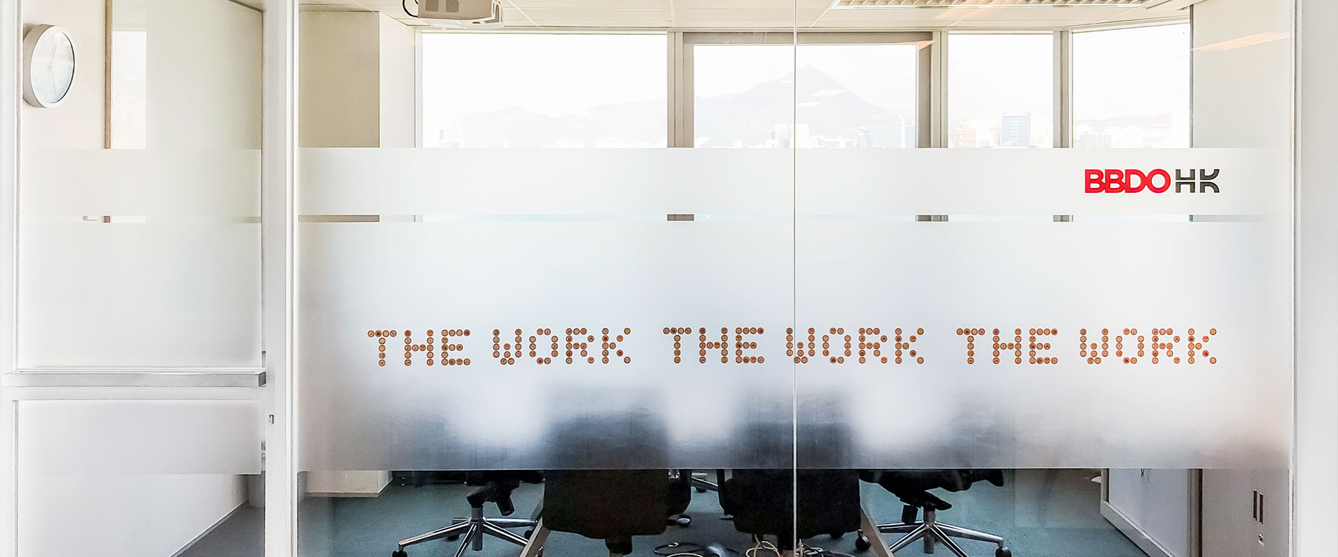
While brainstorming ideas for the project over the weekend, I went out to have dim sum with my family. I thought to myself, nothing was more authentic than the food culture in Hong Kong. The most symbolic food to represent Hong Kong would definitely be dim sum. Therefore, I used dim sum to create a food typography to display The Work The Work The Work.
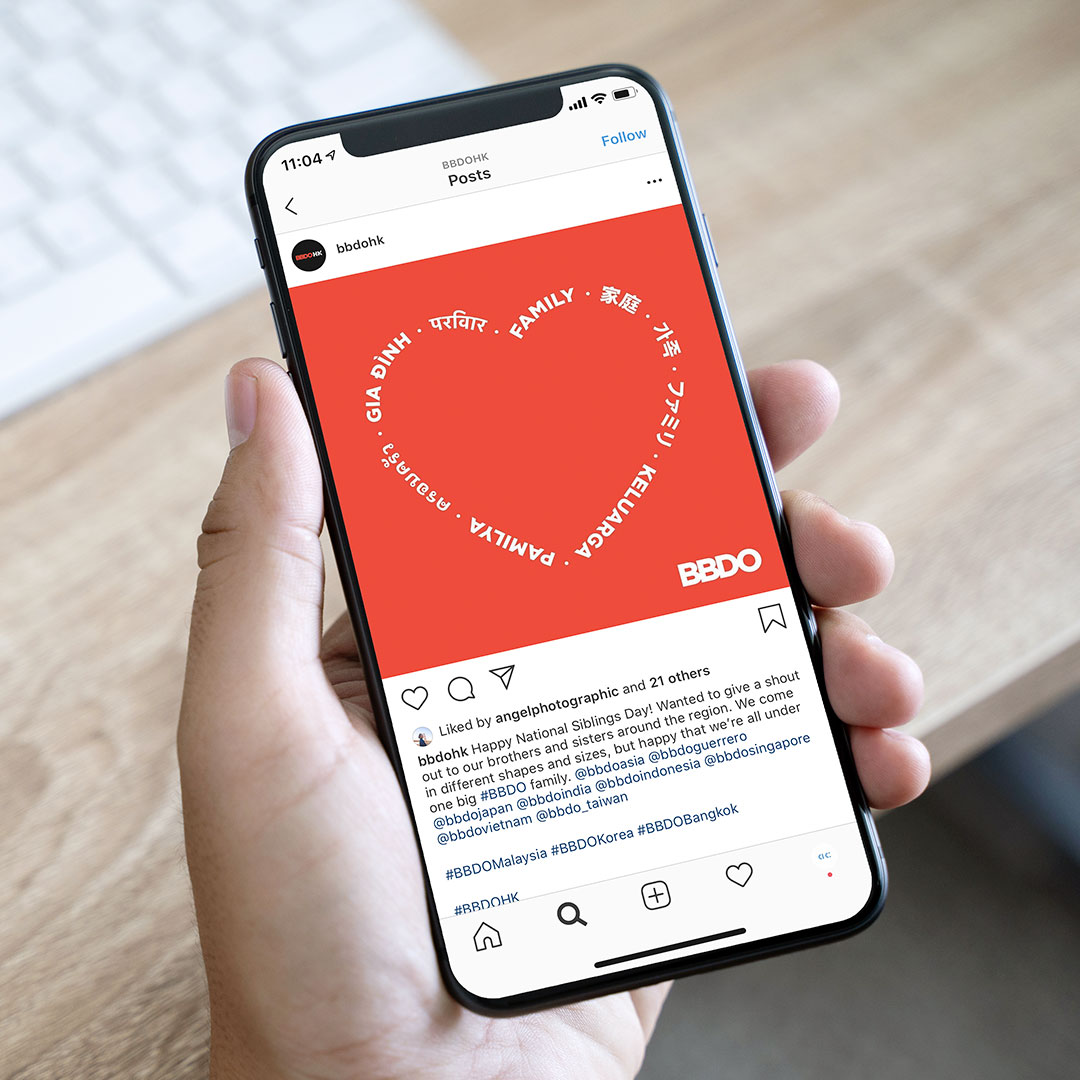
Social Media Design
I also got the opportunity to create social media assets for the @bbdohk Facebook, Instagram, Twitter and LinkedIn accounts, from designing seasonal greeting posts to taking photos for the #officeviews.
I also got the opportunity to create social media assets for the @bbdohk Facebook, Instagram, Twitter and LinkedIn accounts, from designing seasonal greeting posts to taking photos for the #officeviews.